![]() https://www.geospatialecology.com
https://www.geospatialecology.com
Environmental Monitoring and Modelling
Lab 7 - Understanding patterns of historical deforestation
Acknowledgments
- Google Earth Engine Developers
Working with 'THE' Hansen dataset
The Hansen et al. (2013) Global Forest Change dataset in Earth Engine represents forest change, at 30 meters resolution, globally, between 2000 and 2014. Since then, the product is updated annually. Let's start by adding the 2018 update of Hansen et al. to the map. Either import the global forest change data by searching for "Hansen forest" and naming the import gfc2018, or copy the following code into the Code Editor:
var gfc2018 = ee.Image('UMD/hansen/global_forest_change_2018_v1_6');
Map.addLayer(gfc2018);
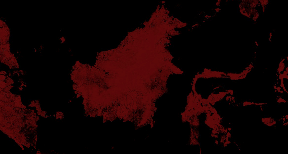
Its important to note that when a multi-band image is added to a map, the first three bands of the image are chosen as red, green, and blue, respectively, and stretched according to the data type of each band. Your image will look red because the first three bands are treecover2000, loss, and gain. The treecover2000 band is expressed as a percent and has values much higher than loss (green) and gain (blue) which are binary ({0, 1}). The image therefore displays as overwhelmingly red.
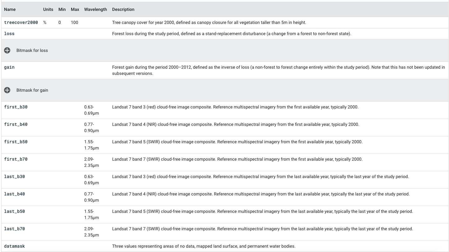
We can gain understanding of the bands in the Global Forest Change data by referring to the table below in the Data Catalogue.
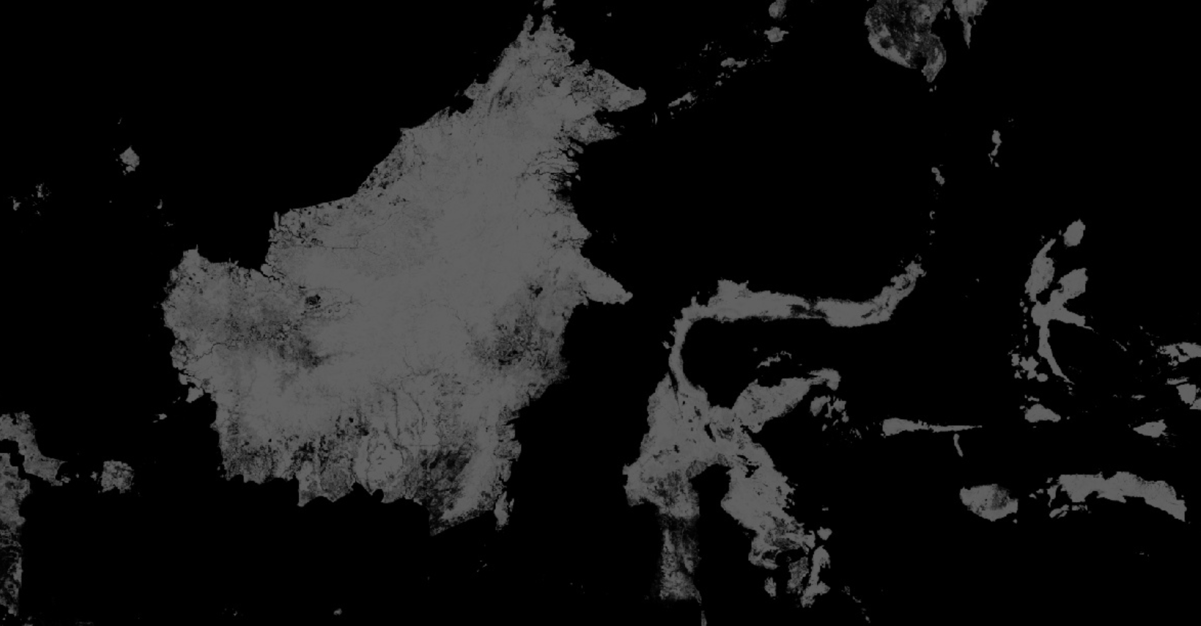
- To display forest cover in the year 2000 as a grayscale image, you can use the treecover2000 band, specified in the second argument to Map.addLayer():
Map.addLayer(gfc2018, {bands: ['treecover2000']}, 'Tree cover in 2000');
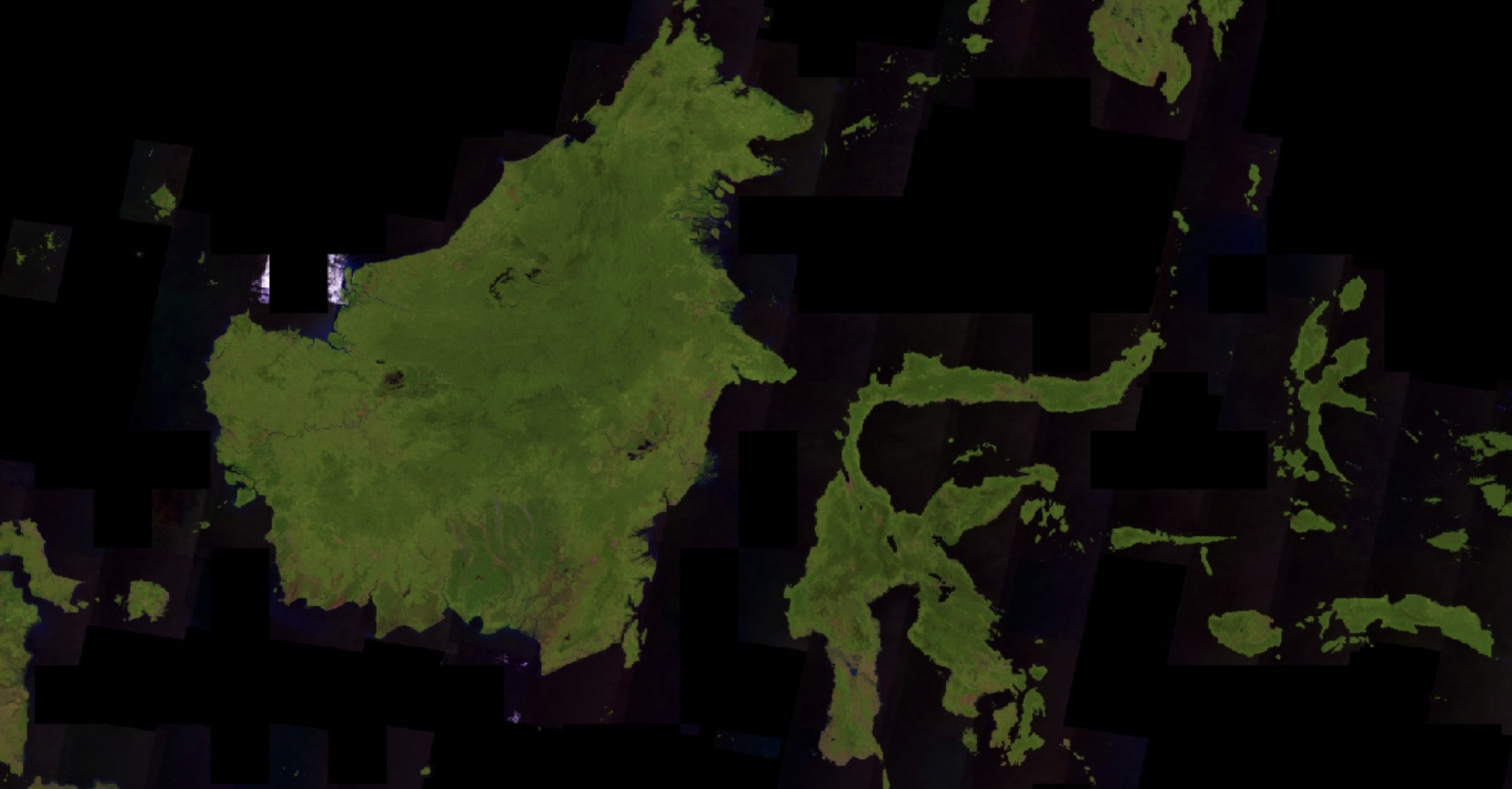
- To display forest cover in the year 2018 as an RGB composite image, we can use bands 5,4 and 3.
Map.addLayer(gfc2018, {bands: ['last_b50', 'last_b40', 'last_b30']}, 'False colour');
- One nice visualization of the Global Forest Change dataset shows forest extent in 2000 as green, forest loss as red, and forest gain as blue. Specifically, make loss the first band (red), treecover2000 the second band (green), and gain the third band (blue):
Map.addLayer(gfc2018, {bands: ['loss', 'treecover2000', 'gain']}, 'Green');
- The loss and gain band values are binary, so they will be barely visible on the image.
- We'd like forest loss to show up as bright red and forest gain to show up as bright blue. To fix this, we can use the visualization parameter max to set the range to which the image data are stretched. Note that the max visualization parameter takes a list of values, corresponding to maxima for each band:
Map.addLayer(gfc2018, {
  bands: ['loss', 'treecover2000', 'gain'],
  max: [1, 255, 1]
}, 'Forest cover, loss, gain');
- This results in an image that is green where there's forest, red where there's forest loss, blue where there's forest gain, and magenta where there's both gain and loss. A closer inspection, however, reveals that it's not quite right. Instead of loss being marked as red, it's orange. This is because the bright red pixels mix with the underlying green pixels, producing orange pixels. Similarly the pixels where there's forest, loss, and gain are pink - a combination of green, bright red and bright blue.
Palettes and Masking
- To display each image as a different colour, you can use the palette parameter of Map.addLayer() for single band images. Palettes let you set the colour scheme with which the image is displayed
Map.addLayer(gfc2018, {
  bands: ['treecover2000'],
  palette: ['000000', '00FF00']
}, 'Forest cover palette');
- The image shown above is a bit dark. The problem is that the treecover2000 band has a byte data type ([0, 255]), when in fact the values are percentages ([0, 100]). To brighten the image, you can set the min and/or max parameters accordingly. The palette is then stretched between those extrema.
Map.addLayer(gfc2018, {
  bands: ['treecover2000'],
  palette: ['000000', '00FF00'],
  max: 100
}, 'Forest cover percent');
-
All of the images shown so far have had big black areas were there the data is zero. For example, there are no trees in the ocean. To make these areas transparent, you can mask their values. Every pixel in Earth Engine has both a value and a mask. The image is rendered with transparency set by the mask, with zero being completely transparent and one being completely opaque.
-
You can mask an image with itself. For example, if you mask the treecover2000 band with itself, all the areas in which forest cover is zero will be transparent:
Map.addLayer(gfc2018.mask(gfc2018), {
  bands: ['treecover2000'],
  palette: ['000000', '00FF00'],
  max: 100
}, 'Forest cover masked');
- Pulling this all together we can make a visualization of the Hansen data that shows all trajectories of change. In this example, we're putting everything together with one small difference. Instead of specifying the bands parameter in the Map.addLayer call, we're creating new images using select()
//Whole script
var treeCover = gfc2018.select(['treecover2000']);
var lossImage = gfc2018.select(['loss']);
var gainImage = gfc2018.select(['gain']);

// Add the tree cover layer in green.
Map.addLayer(treeCover.updateMask(treeCover),
    {palette: ['000000', '00FF00'], max: 100}, 'Forest Cover');

// Add the loss layer in red.
Map.addLayer(lossImage.updateMask(lossImage),
            {palette: ['FF0000']}, 'Loss');

// Add the gain layer in blue.
Map.addLayer(gainImage.updateMask(gainImage),
            {palette: ['0000FF']}, 'Gain');
-
Observe that there are three addLayer() calls. Each addLayer() call adds a layer to the map. Mousing over the Layers button in the upper right of the map reveals these layers. Each layer can be turned off or on using the checkbox next to it, and the opacity of the layer can be affected by the slider next to the layer name.
-
Note that a layer showing the pixels with both loss and gain is missing. It is missing because we need to know how to perform some calculations on image bands before we can calculate which pixels show both loss and gain.
Charting yearly forest loss
Calculating total forest area lost in a given region of interest can be achieved using the reduceRegion method. However if we want to compute the loss for each year we need to use a Grouped Reducer.
To group output of reduceRegion(), you can specify a grouping band that defines groups by integer pixel values. The following example shows how to:
- add the lossYear band to the original image. Each pixel in the lossYear band contain values from 0 to 18 indicating the year in which the loss occurred
- use a grouped reducer, specifying the band index of the grouping band (1) so the pixel areas will be summed and grouped according to the value in the lossYear band.
- analyse trends on a per country basis
// Load country boundaries from LSIB.
var countries = ee.FeatureCollection('USDOS/LSIB_SIMPLE/2017');
// Get a feature collection with just the Malaysia feature. Country codes here: https://en.wikipedia.org/wiki/List_of_FIPS_country_codes#I
var malay = countries.filter(ee.Filter.eq('country_co', 'MY'));

// Get the loss image.
// This dataset is updated yearly, so we get the latest version.
var gfc2018 = ee.Image('UMD/hansen/global_forest_change_2018_v1_6');
var lossImage = gfc2018.select(['loss']);
var lossAreaImage = lossImage.multiply(ee.Image.pixelArea());

var lossYear = gfc2018.select(['lossyear']);
var lossByYear = lossAreaImage.addBands(lossYear).reduceRegion({
  reducer: ee.Reducer.sum().group({
    groupField: 1
    }),
  geometry: malay,
  scale: 30,
  maxPixels: 1e9
});
print(lossByYear);
- Once you run the above code, you will see the yearly forest loss area printed out in a nested list called groups. We can format the output a little to make the result a dictionary, with year as the key and loss area as the value. Notice that we are using the format() method to convert the year values from 0-18 to 2000-2018.
var statsFormatted = ee.List(lossByYear.get('groups'))
  .map(function(el) {
    var d = ee.Dictionary(el);
    return [ee.Number(d.get('group')).format("20%02d"), d.get('sum')];
  });
var statsDictionary = ee.Dictionary(statsFormatted.flatten());
print(statsDictionary);
- Now that we have yearly loss numbers, we are ready to prepare a chart. We will use the ui.Chart.array.values() method. This method takes an array (or list) of input values and an array (or list) of labels for the X-axis.
var chart = ui.Chart.array.values({
  array: statsDictionary.values(),
  axis: 0,
  xLabels: statsDictionary.keys()
}).setChartType('ColumnChart')
  .setOptions({
    title: 'Yearly Forest Loss',
    hAxis: {title: 'Year', format: '####'},
    vAxis: {title: 'Area (square meters)'},
    legend: { position: "none" },
    lineWidth: 1,
    pointSize: 3
  });
print(chart);
GEARS - Geospatial Ecology and Remote Sensing - https://www.geospatialecology.com
(c) Shaun R Levick